
By Tanou Balde and Amma Panin
Last Updated: May 27th, 2020
There seems to be good news regarding the number of COVID-19 cases coming out of sub-Saharan Africa. The region has fewer cumulative reported cases per million than anywhere else in the world. The first infection was reported in the region about fifty days ago. By the end of May, on average, sub-Saharan African countries report 4 new cases each day per 1 million of their populations. Seventy days into their infections, other countries were reporting 65 (Italy), 77 (USA), 39 (Germany) new infections per day per 1 million.
However, without knowing about the tests that produce these numbers, it is impossible to know if this tentative good news is useful. In this blog post, we analyze COVID-19 testing data from the small number of sub-Saharan African countries where it is consistently available. We highlight five findings:
- Data on confirmed cases can be misleading without information on the testing strategy.
- Information on testing in Sub-Saharan Africa is very limited and we focus on six countries where it is consistent.
- Sub-Saharan African countries with testing data are testing fewer people than countries in other regions at similar stages in the pandemic.
- Despite the smaller number of tests per million in sub-Saharan Africa, the ratio of cases per test is decreasing. This is good news.
- But we cannot extrapolate from six countries to a region of 48. We need more data on testing.
1. Data on confirmed cases can be misleading without information on the testing strategy
To manage a pandemic most effectively, we need to know how many people are infected. Since COVID-19 has spread, we have become accustomed to looking at data on confirmed cases as a proxy for infections. We scrutinize the trend lines for inflection points and hints that the curves are flattening. It is misleading to read too much into these trends because the number of confirmed cases we see depends on the number of tests that have been done (and who is being targeted by those limited tests – such as hospitalised patients).
Figure 1 uses a simulation to demonstrate this point. In the figure, two hypothetical countries have exactly the same levels and growth rates of actual infections. They have very different testing strategies. The country in Panel A tests about 0.6% of its population each day. This is similar to Kenya’s testing trajectory. The country in Panel B started off testing 0.6% of its population and scaled it up to 5% after fifty days. This is similar to Ghana’s testing trajectory.
Using the confirmed cases curves to make decisions would be very misleading. It looks like the country in Panel B has more cases every day, but this is only because the country is testing more. In this simulated example, we know the actual number of infections. In reality, data on confirmed cases is now widely available on a regular basis from most countries. If we don’t know that countries are testing differently, we may end up reaching wrong conclusions based on the confirmed cases data. They can look very different even when two countries have the same underlying rates of actual infections.
2. Information on testing in Sub-Saharan Africa is very limited and we focus on six countries where it is consistent
Data on COVID-19 testing is limited and it is not a uniquely sub-Saharan African problem. We use data aggregated by Our World in Data (OWID) for our global comparisons because their dataset is regularly maintained, transparently documented and publicly accessible.
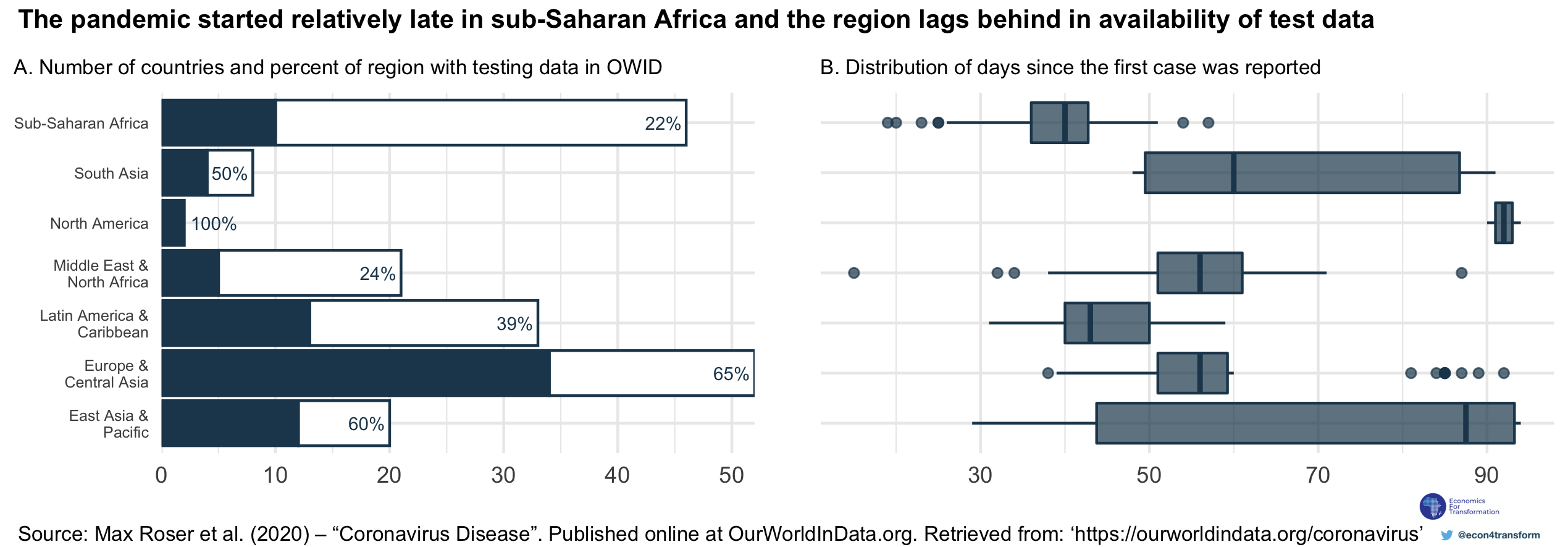
Panel A of Figure 2 shows that about 75 countries appear in the dataset. This number is unevenly distributed across world regions. Only about 20% of countries in sub-Saharan Africa have testing data. This could be because countries have no testing data available. It could also reflect the fact that a global aggregator like OWID faces barriers to accessing data countries where the data is not released in a systematic way. In both cases, countries can improve the data coverage by making testing information available and taking steps to release it in a consistent way.
In total, we have testing data for eleven countries from sub-Saharan Africa. Seven of these overlap with data that appears in the OWID database, and the remainder were collected by members of the Economists for Transformation network. In the charts that follow, we focus on data from Ethiopia, Ghana, Kenya, Nigeria, Senegal and South Africa. These six countries have some of the largest economies on the continent as measured by GDP. They each have 500 or more confirmed cases of COVID-19. Finally, their testing data is maintained and documented by OWID, so we can make international comparisons with a more transparent understanding of the limitations of the comparisons.
3. Sub-Saharan African countries with data are testing fewer people than countries in other regions at similar stages in the pandemic
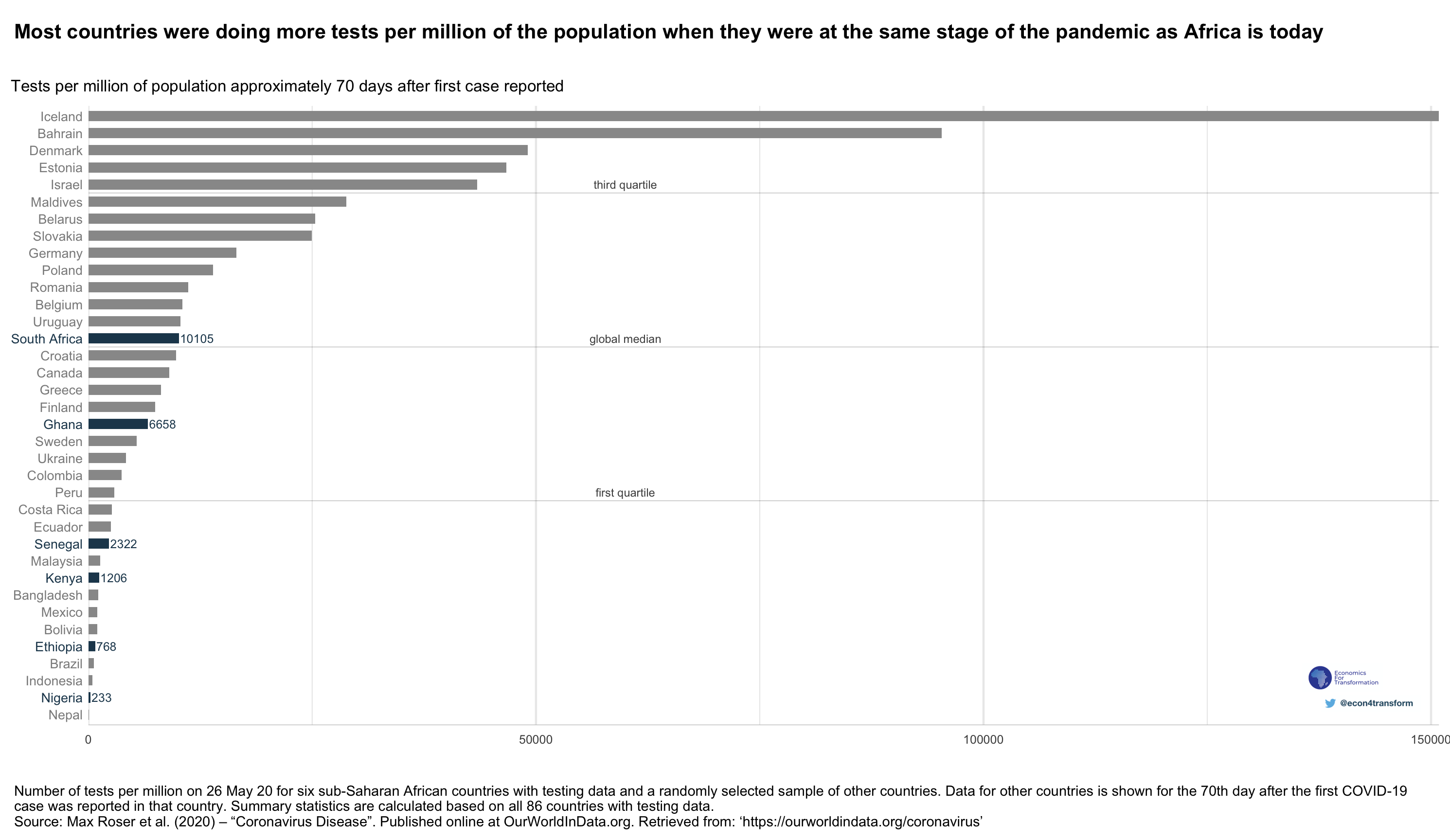
In Figure 3, we plot tests per million of the population. The plot shows data for sub-Saharan African countries with data as well as a random sample of all other countries with testing data. In order to compare countries at similar stages of the pandemic, we show data for the rest of the world from when those countries were 70 days after their first reported case.
South Africa and Ghana are the sub-Saharan African countries testing most intensively. However, even they are conducting just around the global median number of tests per million. Iceland is the country that is testing most intensively in the world. Seventy days into its pandemic, Iceland was testing about 140 thousand more people per million than South Africa is testing today.
4. Despite the smaller number of tests per million in sub-Saharan Africa, the ratio of cases per test is decreasing
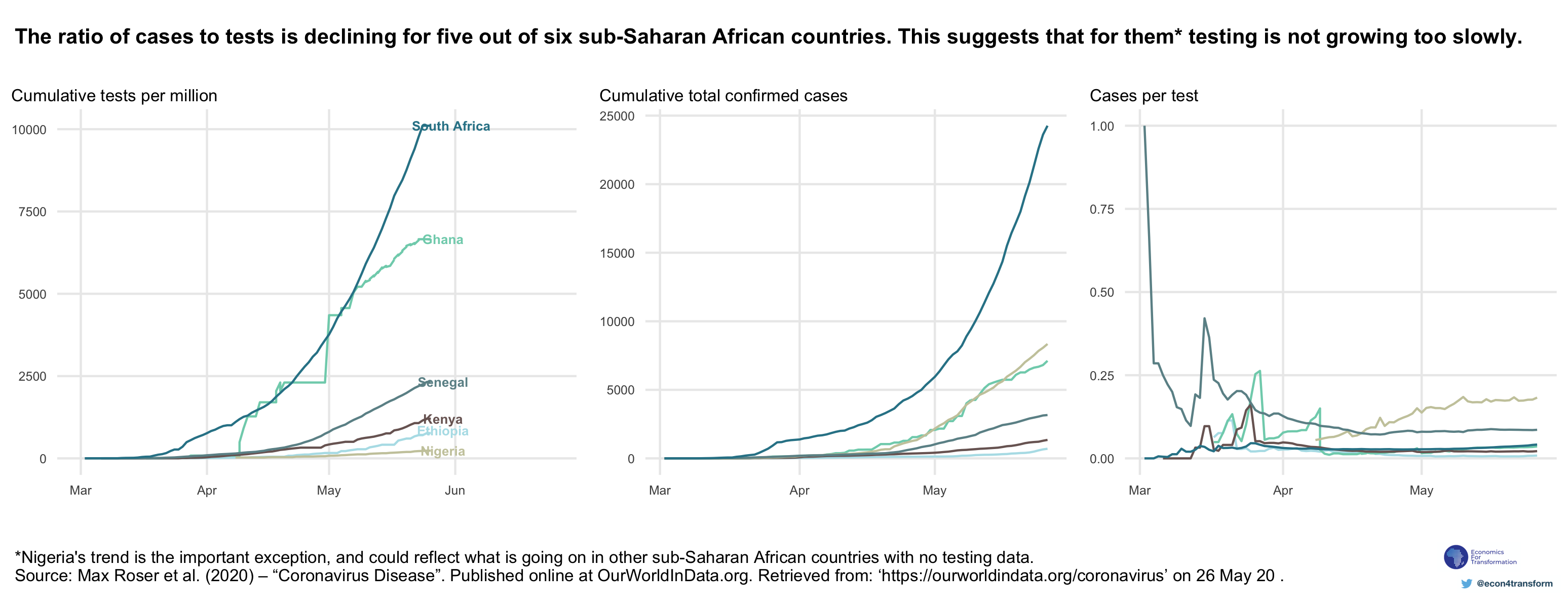
Sub-Saharan African countries are testing smaller proportions of their populations than other regions, but this does not necessarily mean that their efforts are uninformative. A country that indeed has fewer infections would need to be testing fewer people.
We can look at the number of positive cases per test to try to understand this. As time goes on, if a country is doing more tests, and each test yields fewer positive cases, it suggests that the country is able to test a broader range of people, regardless of whether they are infected or not.
We summarise some dynamics between the number of infections, the numbers of tests, and the number of confirmed cases per test in Table 4.1. In all cases, the number of actual infections may be increasing. If the number of tests is increasing more slowly than the number of infections, we would expect to find that the confirmed cases per test will also be increasing. On the other hand, if the number of tests is increasing at a faster rate than the number of infections, confirmed cases per test should be decreasing.
| . | Trajectory of actual cases | Trajectory of tests conducted | What would it look like for cumulative confirmed cases? | What would it look like for confirmed cases per test? |
| Scenario 1 | Increasing | No testing | Zero cases reported, no growth in cases | Undefined |
| Scenario 2 | Increasing | Increasing more slowly than the number of actual cases | Grow slowly | Increasing |
| Scenario 3 | Increasing | Increasing at the same rate or more quickly than the number of actual cases | Growing | Constant or decreasing |
An example may help to clarify the point. If a country has very few tests, it may choose to use them only in severe cases, such as when very sick people show up to hospital. In that case, there is a large chance that every person that is tested will have a positive test result. The ratio of confirmed cases per test will be close to 1. Figure 4 shows that this was the situation of Senegal at the start of March. The country has steadily increased the number of tests and the ratio of cases per test has declined. Worryingly, the ratio of cases per test is increasing in Nigeria. This suggests that Nigeria is not testing broadly enough.
5. We need more data on testing
Five of the six countries with testing data have decreasing rates of cases per test. This is encouraging because it suggests that they are testing a broad range of their populations. We can therefore have more confidence that their confirmed cases are a somewhat meaningful reflection of actual infections. (Unfortunately, these cases continue to increase.)
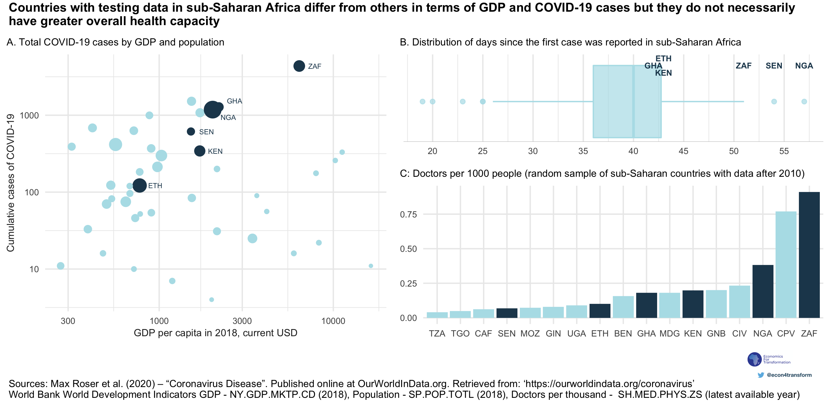
However, these countries are different from the rest of the continent. They have larger economies and populations (Panel A of Figure 5). They also have more confirmed cases, although this in itself may be a function of the fact that they are testing more. These countries have all had more than 40 days since their first infections were reported (Panel B of Figure 5). What does this tell us about testing and infections in the rest of sub-Saharan Africa? Unfortunately, not much.
The countries with testing data available do not necessarily have greater health capacity than others, proxied by the number of doctors per thousand of the population (Panel C of Figure 5). Perhaps they have simply taken an early decision to make a crucial piece of information easily and transparently available.
We have demonstrated that it is important to know about testing in order to make meaningful use of confirmed cases. We have shown that the sub-Saharan African countries performing the most tests per million still lag significantly behind the global leaders. Some countries are increasing testing in a broad manner that can lead to more confidence in their reports of COVID-19 cases. It is early days for the pandemic in sub-Saharan Africa. Reported cases are still increasing around the continent, and the disease could spread along a number of different trajectories in different countries. To manage a pandemic, we need to know how many people are infected. To make a well-informed estimate of that number, we need to know how many people are tested.